A site that measures itself in public
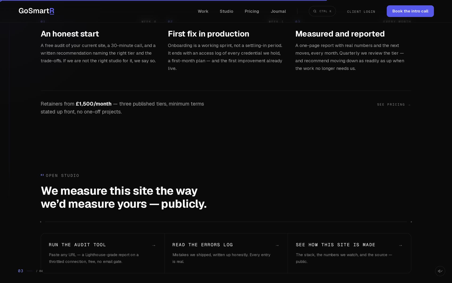
The open-studio section is the site's proof-of-work. Anyone can paste a URL into the audit tool and get a Lighthouse-grade report on a throttled connection, free, no email gate. Next to it sits an errors log — mistakes we shipped, written up honestly — and a see-how-this-site-is-made panel with the stack, the numbers the studio watches, and the source. A studio that pitches measurement has to measure itself first, where clients can check.
The pinned closing theatre
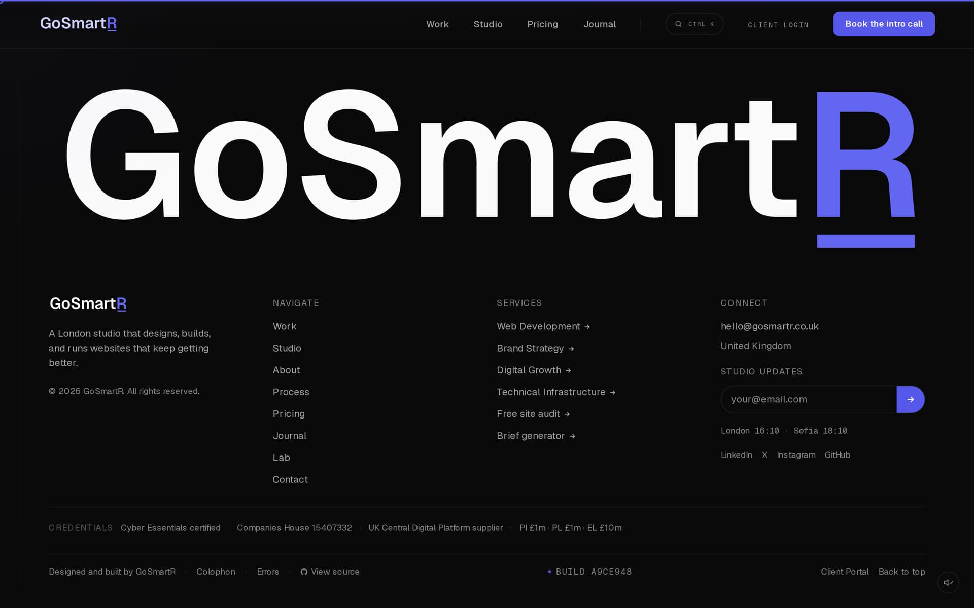
The page closes on a pinned three-stage scene driven by roughly 180vh of scroll: an editorial question, then a live status panel — real London time ticking by the second, current booking availability, and the latest launch resolved from the project data at build time — then the invitation, with a magnetic CTA. Mobile gets a simple stacked layout with no pin; a pinned scene on a touch viewport is a fight you lose.
Ambient life is split from scroll on principle. Continuous loops — a breathing dot, blinking clock separators, a shimmer on a drawn thread — are CSS keyframes that run independently of scroll position, so the scene feels alive even when scroll is parked, at zero JavaScript cost. The closing beats themselves are additional tweens on the existing pin timeline, not new ScrollTriggers.
One motion vocabulary
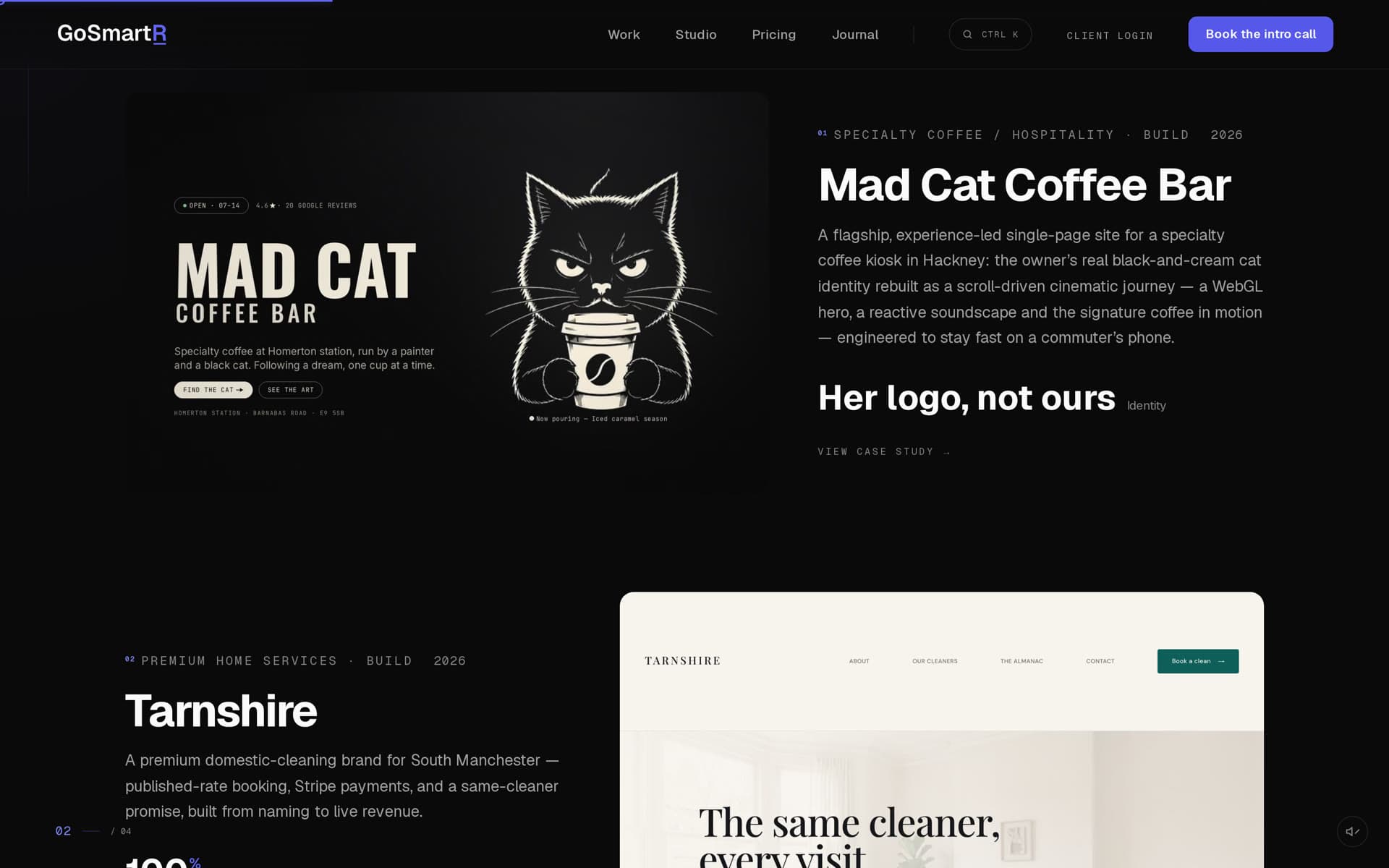
Every animation on the site — mount entrances, scroll reveals, the pinned theatre — draws from a single motion contract: shared easing, duration, and stagger tokens. A first-time visitor can't name why the site feels coherent; this is why. The work index gets the same discipline: four real engagements shown deliberately, each with the claim it can defend, and self-initiated concepts labelled as exactly that.
The hard part: motion that doesn't cost paint
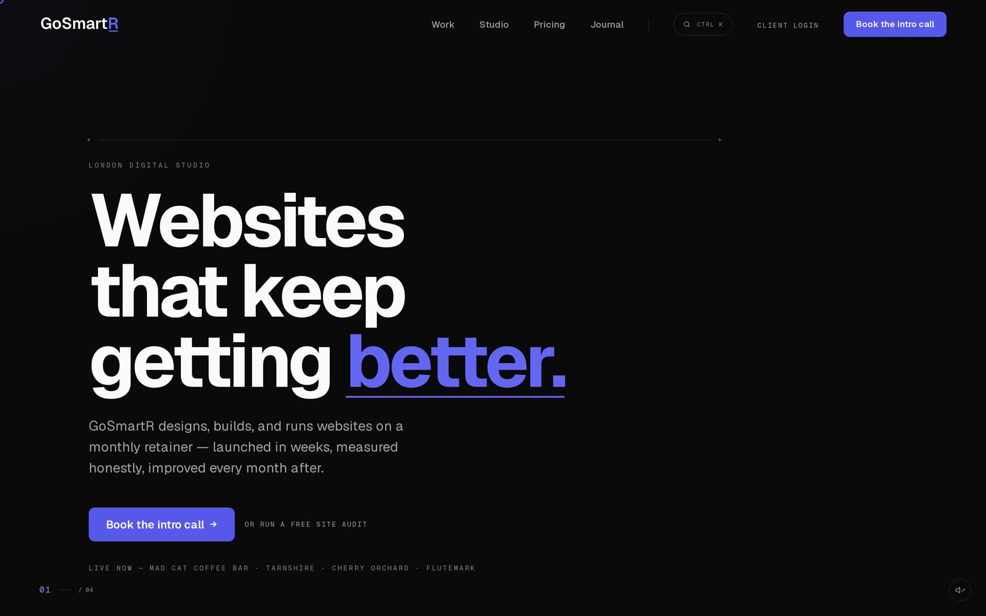
The hero entrance is an enhancement, not a gate. GSAP loads as a lazy chunk, and the entrance plays only if hydration and that chunk both land within a deadline of navigation start — past it, replaying the entrance would yank already-painted content from visible to hidden and back. Fast connections get the choreography; slow ones get an honest static frame.
The subtle one: a performance trace showed the hero subhead — not the headline — was the LCP element, and its opacity-0 reveal raced hydration against first paint. Whenever hydration won, the first counted paint became the post-reveal frame at ~3.3s. The fix: headline and subhead are treated as already visible — opacity stays at 1 and only a 6px transform settle plays, imperceptible and free of layout cost. The smaller elements keep the full reveal; they can never become LCP candidates.
The rest is discipline: WebGL is reserved for the case studies that earn it, ambient media defers, and the hero carries no scroll listener at all — it sits and reads after its one-shot entrance.
Honest numbers
Lighthouse performance: desktop 98–100, mobile 93 — PageSpeed medians over repeated runs, because a single cold run is throttling noise, not a measurement. The full prefers-reduced-motion path is first-class: every scroll scene has a static equivalent, not a broken half-animation.
The motion is the easy part. Keeping continuous scroll choreography inside a high-90s performance budget — and letting anyone audit the result from the page itself — is the engineering. It's the difference between a studio site that demonstrates capability and one that contradicts it.